We are delighted by the quality and the creativity of all the submissions received. We invite you to browse
the digital exhibition below, which displays the top visualisations submitted by talented participants
from all around the World, all of which provide valuable insights into relevant development policy question
based on the indicators of the MDG database.
We invite you to browse the gallery below and explore the winning solution, submitted by Jeremy Boy from France,
as well as other five finalist solutions.
This is a website by UNStats, the United Nations Statistics Division, a Division of the Department of Economic
and Social Affairs.
First Place
Is the world a better place today?
Jeremy Boy (France / New Zealand), with the help of Anshul Vikram Pandey and Jean-Daniel
Fekete
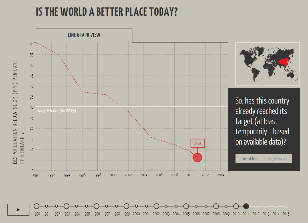
"Is the world a better place today?" (isWBPT) is a web-based, interactive visualisation app based on the
Millenium Develoment Goals data. This
visualisation for the people is designed to help users overcome three potential barriers, which are often
overlooked in the design of visualisations and in the presentation of data:
the literacy barrier: people need to understand what they are looking at, and that the graphics represent
underlying data;
the interaction barrier: people need to know whether a visualisation is interactive or simply static, and
they need to know in time what interactions are possible; and
the task barrier: people need to know what tasks to perform with the visualisation and data in order to
imagine new, and interesting ways of questionning the data.
isWBPT addresses these barriers in a “narrative” introductory tour. The visitor is first invited to select
a target and indicator from a subset of the data, as well as a country of interest. S/he is then shown a
line graph view of the evolution of this country between 1990 and 2015 (i.e., the time period for which most
Millenium Development Goals were set); and a series of simple questions ensure her comprehension of the graphic.
S/he is then shown multiple countries and aggregated values, which aim to ensure her comprehension of simple
statistics (i.e., means and medians). Finally, the concepts of correlation and correlation coefficient are
introduced, and s/he is invited to freely explore the entire dataset, looking for predicitve relationships
to tweet about.
As such, this app not only communicates about the data, it also allows visitors to explore them, and it shows
them how. This can lead to new insights, and may even lead to finding new, crowdsourced solutions for making
the world a better place.
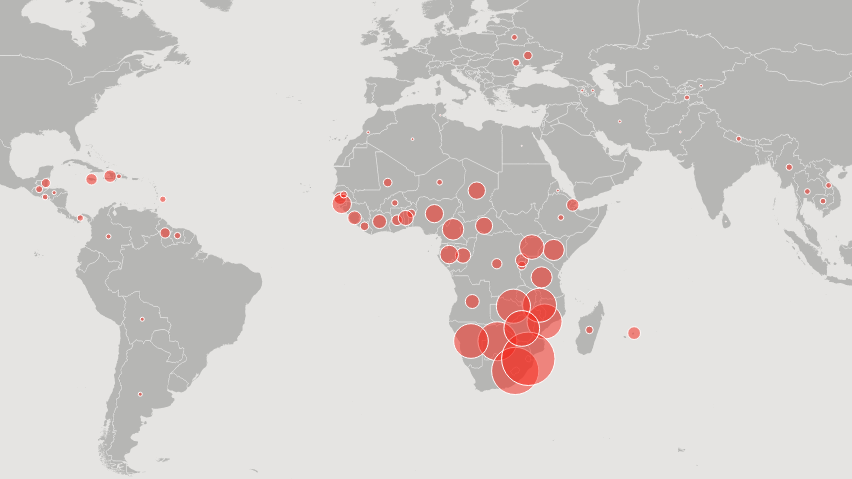
An exploration of the HIV incidence rate, which measures the number of new HIV infections as a percentage of
the population.
Visualisations include a line plot of the HIV incidence rate by region, a world map of the
HIV incidence rate by country with a slider to view by year from 1990 to 2013, and a heat map of the 20 countries
with the highest average HIV incidence rate from 1990 to 2013, by country and by year. Predictive modeling
was also explored to look for factors which may be significant in reducing the incidence rate.
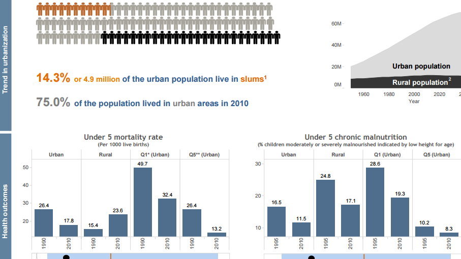
Given our focus on urban health, the project intended to elicit the magnitude of health inequities in urban
areas using MDG indicators. We want to highlight that sections of the urban population are disadvantaged
in accessing services and achieving healthy outcomes.
The project, therefore, focused on providing a quick
and clear understanding of the current situation as well as trends, while providing benchmarks for each country
to compare their performance with others. We used a pooled dataset to obtain MDG indicators and used data
visualisation tools to construct country profiles. The results of this project have been acknowledged by
the WHO Global Health Observatory in 2015 and have contributed to raising awareness on urban health inequity.
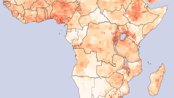
"The Urban Century: Exploring the impact of "Slumification" on Development Goals"
Niccolo Cirone (Italy)
This project is intended to encourage further analysis on the difference between development policies for rural
areas and policies for slums, and on how we can make sure that our development actions are can be effectives
in urban environments. This Visualisation was chosen by Tableau Software as “Viz of the Day” on August 30,
2015.
Behind the scenes of the UN Millennium Goal Development Report
Katharina Rasch (Germany)
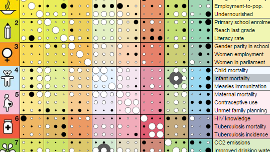
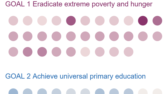
”Behind the scenes...” is a visualisation of the metadata behind the UN Millennium Goal Development report.
It answers questions such as ”How much data is behind the MGD report?”, ”How many people does it represent?”.
Users can explore how much data has been collected about each of the millennium goals. They can learn how
much of Earth’s population is represented in each of data points collected and see for which goals the UN
is making progress in collecting more data in recent years. The visualisation can be a companion when reading
the report or looking at other visualisations. It can be used to investigate if results presented are grounded
on a sound basis of data.